Documentation Index
Fetch the complete documentation index at: https://lightdash-update-dbt-code-blocks.mintlify.app/llms.txt
Use this file to discover all available pages before exploring further.
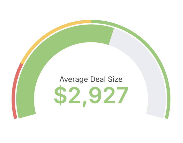
- Choose a single metric as the value to display.
- Optionally define min and max bounds for the scale.
- Configure colored ranges to communicate thresholds (for example: red, amber, green bands).
- Use gauges sparingly and for monitoring, not detailed analysis.
- Prefer descriptive labels and units so the value is immediately clear to viewers.